Frank Lloyd Wright + Color
By Sophie Aliece Hollis
“The healthful color schemes possible in interiors at a cost of little more than the brains and stains are something wonderfully beautiful. Color has a tremendous influence on our moods and cannot be too carefully considered.” – Frank Lloyd Wright, “The Architect and the Machine,” 1894.[1]
Just one year after the establishment of his own practice, Frank Lloyd Wright expressed this view on color in his first-ever professional speech. Titled “The Architect and the Machine,” this speech, which was delivered to the University Guild of Northwestern University, outlined Wright’s progressive architectural philosophy. Although Wright stresses the deep value he placed on color in architecture, this statement serves as one of the few recorded examples where Wright mentions the topic. How then, are we to understand this crucial aspect of Wright’s work? To answer that question, one must understand the overall aims of organicism.
Wright’s organic architecture was centered around creating compositions that functioned as one cohesive whole, harmonious with place, people, and time. In order to achieve this, Wright mastered the art of seamlessly weaving together individual design components. This is where we will come to understand Wright’s use of color- as an integral part of a functioning system.
Through constant experimentation over the course of his career, Wright reimagined, revised, and redefined his vision for this whole, which naturally affected each of its parts. By examining each phase of Wright’s dynamic career, one can discover the intrinsic, yet relatively understated, role of color in the comprehensive architecture of Frank Lloyd Wright.
“Colors require the same conventionalizing process to make them fit to live with that natural forms do; so go to the woods and fields for color schemes. Use the soft, warm, optimistic tones of earths and autumn leaves in preference to the pessimistic blues, purples, or cold greens and grays of the ribbon counter; they are more wholesome and better adapted in most cases to good decoration.” – Frank Lloyd Wright, “In the Cause of Architecture,” 1908.[2]
After gaining considerable national attention for his work in the Prairie Style, Wright published an essay in Architectural Record that reiterated his unique design philosophy on a much larger platform. Titled “In the Cause of Architecture,” this essay matter-of-factly delineated six specific principles fundamental to the production of his innovative and illustrious organic architecture. Color again appears a key element in this iteration as Wright devotes his fourth principle to explaining its role in his designs. Here, he uses the term “conventionalization” to describe the creative process on which his designs depend. Wright believed that, in order to create a cohesive whole harmonious with place, people, and time, the designer must abstract forms from nature. As he notes, this creative process must be applied when creating color schemes.
He continues this fourth organic principle by instructing readers to “go to the woods and fields for color schemes.”[3] While he derived colors from nature throughout the entirety of his career, Wright did so most literally during the Prairie period. This period, which lasted from 1893-1909, boasted a distinct autumnal color palette which furthered the analogy of the building to the prairies of the Midwest.
Wright employed a variety of muted natural tones through multiple architectural facets. The most obvious of which was his choice of paint colors. As shown in the Dana Thomas House, Wright’s first “blank-check,” or no-budget commission,[4] deep hues of greens, oranges, and yellows coat the walls, ceilings, and barrel vaults of this expansive Springfield, Illinois home. Similar color language is carried to the exterior, where Wright uses a faded ochre for the trim atop the beige brick construction.
Materials were another major facet through which Wright incorporated color into his designs. Since his fifth organic principle instructed readers to “bring out the nature of materials used,”[5] Wright always generated color palettes complementary to the natural hues of local construction materials. He demonstrated this yet again in the Dana Thomas house with the use of green, oxidized copper gutters to match the surrounding landscape and geometric ornamentation along the upper level of the house.
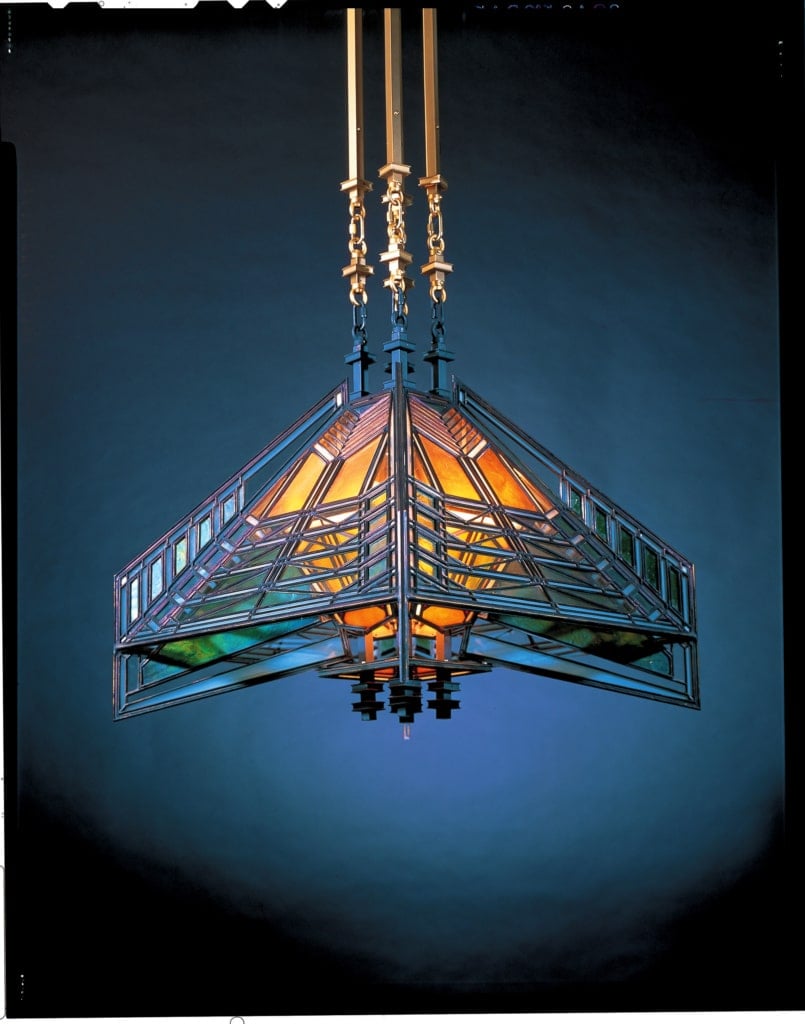
This ornamentation serves as yet another example of Wright’s integration of color in his designs. Also tying into his first organic principle which dictated, “Decoration is dangerous unless thoroughly understood in relation to the whole,”[6] Wright used careful abstraction from nature to create unprecedented geometric decoration. This decoration is a huge defining characteristic of the Prairie period as it manifests itself within many intricately designed lighting fixtures, and art glass windows. Rather than replicating nature within his ornamentation, Wright took aspects from nature─trees, plants, landscapes─and abstracted them into colorful geometric designs. This process allowed the decoration to be understood in relation to the formal whole and incorporate colors from the woods and fields. An exquisite example of Wright’s colorful conventionalization can be seen within a series of chandeliers and lamps, again in the Dana Thomas house. These light fixtures use completely abstract geometries in bright colors to represent butterflies.
As dictated in his fourth organic principle and shown immaculately throughout the Dana Thomas house, Wright’s use of color is completely intertwined within his overall design process. Each colorful example of paint, material, and ornament works to foster a harmonious connection between the home and its Prairie site.
“In buildings themselves, in the sense of the whole, there is lacking neither richness nor incident; but these qualities are secured not by applied decoration, they are found in the fashioning of the whole, in which color, too, plays as significant a part as it does in an old Japanese woodblock print.” – Frank Lloyd Wright, “Ausgefuhrte Bauten und Entwurfe von Frank Lloyd Wright,” 1910.[7]
Following the Prairie period, Wright entered the phase of his life at times referred to as the “Lost Years.”[8] Although tumultuous and elusive, these years were a highly influential and experimental period of Wright’s career. In eleven years, Wright moved to Europe, published an internationally acclaimed portfolio, returned to design and build Taliesin, and opened offices in Chicago, Tokyo and Los Angeles.
From 1909-1911, Wright traveled Europe, fervent in his desire to continue developing his conventionalization process. While there, Wright worked with German publisher, Ernst Wasmuth, to create a monograph of his work of the Prairie period. In it, he again mentions the importance of color and its relation to the whole. He then references one of only three admitted influences on his work:[9] the Japanese wood-block print. A fan of their simple and direct portrayal of natural forms, Wright collected and sold thousands of these prints over the course of his life. He admired their powerful intersection of line, form, and color, which was also true of Wright’s second admitted influence, the Froebel Kindergarten Gifts.
Wright found himself drawn to similar, simple geometric relationships while in Europe. He quickly became fascinated by examples of primary forms in primitive arrangements and began to experiment with these straight-forward ensembles to create ornament.[10] These explorations manifested themselves in the designs of two large-scale public commissions: Midway Gardens in Chicago (1913) and the Imperial Hotel in Tokyo, Japan (1915).[11] Both massive public projects contained large, colorful, geometric murals. These murals presented ensembles of basic shapes─square, circle, triangle—intersecting along specific axes and grids to create seemingly random, colorful compositions. Wright used these larger primary shapes as opportunities to portray more primary colors, demonstrating a transition from the intricate earth-tones found in the art glass of the Prairie Period.
This shift was also present at the residential scale. Although still employing art glass as a form of ornamentation, Wright grew even more simple and direct in his geometric designs. As shown in the windows of the 1912 Coonley Playhouse, a triptych known as “Kindersymphonies,”[12] confetti, balloons, and flags are represented using only circles and rectangles of solid, bright colors. Although these are not necessarily natural forms or colors, they work in harmony with the whole for they relate to its intended inhabitants: school children. Wright continued to experiment with these sharp, bright shades as he settled back into a more permanent life in America in the early 1920s.

“Colors— in paste or crayon— or pencils— always a thrill! To this day I love to hold a handful of many-colored pencils and open my hand to see them lying loose upon my palm, in the light.” – Frank Lloyd Wright, “In the Cause of Architecture III: The meaning of Materials— Stone,” 1928.[13]
Wright’s colored pencils, a staple in his home and studio, were put to especially extensive use during the late 1920’s and early 1930’s. At this time, money was scarce for the Wrights as commissions had slowed and maintaining such disparate offices was growing infeasible. In an attempt to generate some income, Wright designed a series of bright, geometric covers for Liberty Magazine. Although never published, these designs were in keeping with the creative ensembles of the teens. This generation of color remained prevalent throughout the entirety of his career, as we see one of these cover designs, titled March Balloons, appear within a carpet for one of Wright’s later residences for his son and his wife, David and Gladys Wright, in 1952.[14]
While creative ensembles long remained in the back of Wright’s mind, he underwent another significant color shift in the 1930’s. Due to the poor economic conditions of the United States following the Great Depression, Wright’s complex residential designs were out of reach for most Americans. In response to this, Wright developed a more contemporary design philosophy, which reflected his progressive view for a democratic American architecture. While Wrights designs for this new America, or “Usonia” as he so called it, continued to promote the notion of a cohesive whole, Wright also worked to achieve a far simpler, more cost-effective design. Due to this formal switch, Wright’s use of color changed greatly. The previous intricacies of the Prairie style and the elaborate geometric ensembles of the Lost Years no longer fit with the social and cultural changes that were redirecting the country. So, Wright developed another way to incorporate color within this simpler whole: by highlighting the geometric modules upon which the houses were designed. Based on the repetition of simple geometric shapes, such as the square or hexagon, Usonian homes characteristically followed simple, L-shaped plans and were expertly proportioned.
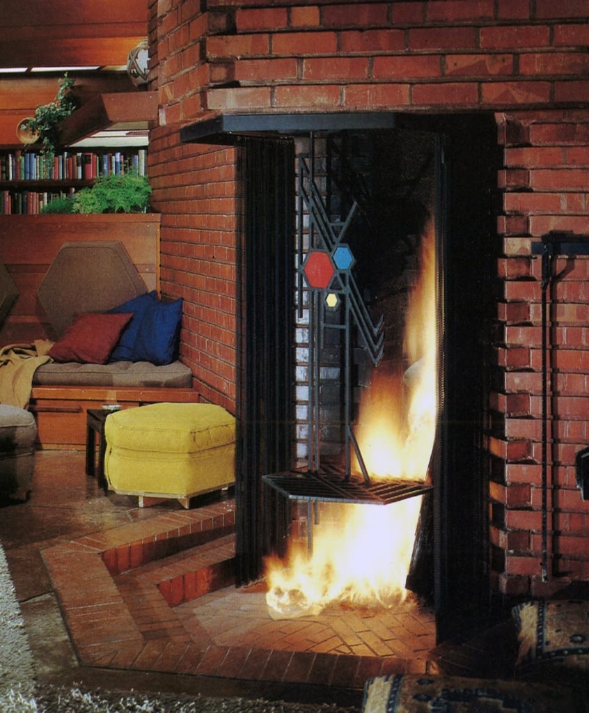
Most Usonian homes directly communicated their module through the scoring of their concrete floors. In order to highlight this geometry and bring color to the space, Wright typically stained these floors with a deep red. In keeping with his ideal of a comprehensive whole, Wright also designed Usonian furniture to display the geometric modules. Within the Hanna House, the hexagonal module is colorfully reiterated through the upholstery of various hexagonal chairs, stools, and pillows. The module is also repeated in the ironwork of the fireplace, where Wright has positioned three hexagons: one large and red, one mid-sized and blue, and one small and yellow. Just as Wright stripped his designs down to the most essential forms and materials in the Usonian houses, he did so too with color. This detail, which contains only the three, basic primary colors, again demonstrates how Wright carefully tailored his color selection to the overall ambition of his designs.
“Red is the color of Creation” – Frank Lloyd Wright, Correspondence with Hilla Rebay, 1945.[15]
In a correspondence with Hilla Rebay, the first director of the Solomon R. Guggenheim collection, Wright expressed this opinion on the color red. Although mentioned light-heartedly in an attempt to persuade Rebay on the paint color for the museum, this comment alludes to a significant color theme within Wright’s work: Cherokee Red. The origins of this color, which exists in a variety of shades across Wright’s extensive repertoire, are highly debated.
Below the McDowell Mountains of Scottsdale, Arizona, Wright designed and built Taliesin West, an escape for his fellowship of apprentices from the cold winters of Taliesin East in Spring Green, Wisconsin. Here, shades of this celebrated red appear all over the compound. Much of the structural work is coated in a deep brownish-red to compliment the extensive desert masonry. The main entrances are painted with a more vibrant orange-red to denote their importance. Much of the unique, geometric furniture is upholstered in an almost cherry-red fabric.
This interesting convergence of reds at Taliesin West can be viewed as an overall representation of Wright’s color development within the first 40 years of his career. When he began in the Prairie period, Wright employed a neutral color palette analogous to the prairies of the Midwest. As he moved into explorations of geometric ensembles during the teens, Wright incorporated examples of more vibrant colors. He then managed to pack deep fundamental meaning into his Usonian homes using only the most basic of shapes in simple, primary colors. The key color elements of these three major phases are synthesized, as they are in Taliesin West, throughout the iconic, large-scale projects Wright completed in the last two decades of his life.
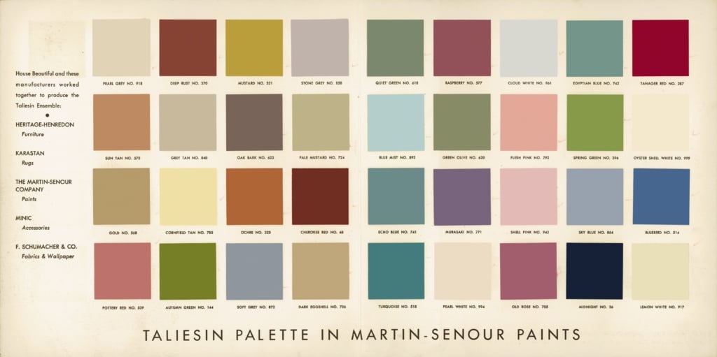
“There is no bad color. No one color is better than another in itself, except as bad use is made of it or the quality of color is itself poor.” – Frank Lloyd Wright, Correspondence with Hilla Rebay, 1945.
In 1955, the Martin-Senour Paint Company released “The Taliesin Palette,” which commercialized 36 paint colors[16] representative of the architecture of Frank Lloyd Wright. This palette, which spans quite a wide color spectrum, serves as a convincing visual representation of Wright’s above quoted attitude toward color by the end of his life.
Through a constant exploration and evolution of his organicism, Wright was able to test the limits of color to the point of mastery. In the last two decades of his career, he employed a mix of the techniques within his vast knowledge of color to continue creating some of the most iconic works of architecture in existence.
Although Wright was unsuccessful in convincing Hilla Rebay to paint the Guggenheim red, the unprecedented structure, along with many of his final designs, is adorned with one of Wright’s signature, Cherokee Red, clay tiles.
______
Sophie Aliece Hollis is an Undergraduate Architecture student at The University of Texas at Austin School of Architecture with a minor in Journalism. Bringing the two fields together, she is also a freelance writer for Texas Architect Magazine.
______
[1] Frank Lloyd Wright et al., Frank Lloyd Wright Collected Writings (New York, NY: Rizzoli, 1993), 24.
[2] Frank Lloyd Wright, Andrew Devane, and Frederick Albert Gutheim, In the Cause of Architecture, Frank Lloyd Wright: Essays(New York, NY: Architectural Record, 1975), 157.
[3] Wright, Devane, and Gutheim, In the Cause, 157.
[4] “Dana Thomas House Foundation,” https://dana-thomas.org/.
[5] Wright, Devane, and Gutheim, In the Cause, 157.
[6] Wright, Devane, and Gutheim, In the Cause, 157.
[7] Wright et al., Frank Lloyd, 113.
[8] A. Alofsin, Frank Lloyd Wright: The Lost Years, 1910-1992: A Study of Influence (Chicago, IL: Ill. University of Chicago Press, 1993), 5.
[9] Margo Stipe and Alan Weintraub, Frank Lloyd Wright: The Rooms ; Interiors and Decorative Arts (New York, NY: Rizzoli, 2014), 50.
[10] Alofsin, Frank Lloyd, 60.
[11] Alofsin, Frank Lloyd, 72.
[12] Alofsin, Frank Lloyd, 43.
[13] Wright, Devane, and Gutheim, In the Cause, 213.
[14] Penny Fowler, Frank Lloyd Wright: Graphic Artist (Rohnert Park, CA: Pomegranate, 2002), 82.
[15] Joan M. Lukach and Thomas M. Messer, Hilla Rebay: In Search of the Spirit in Art (New York, NY: Braziller, 1983), 191.
[16] Lukach and Messer, Hilla Rebay, 192.